We talk about Intermarket Analysis a lot—especially the concept of reviewing multiple asset classes to either add or detract from the current price trends.
As markets become increasingly interconnected, cross-asset price action can’t be ignored; so, how can you apply this in real life? What indicators can be used to perform Intermarket Analysis?
Before we dive into the indicators and applications, we need to understand a paradoxical but straightforward concept, utilizing Intermarket Analysis in conjunction with our current methodology rather than replacing it.
The old saying goes, “trade the chart in front of you.” However, it’s necessary to be mindful of the behavior of other asset classes.
Relationships will diverge and become uncorrelated from their counterparts because, well, markets are just like that.
There’s always a barrier: nearly all major meltdowns in equities precede a divergence in some kind of risk proxy, but not all divergences in a risk proxy result in equity meltdowns. See the predicament? These proxies serve more as a “yield sign” than a “red traffic light” and should be treated as such.
Now that we have some of the nuances out of the way, it’s time to unpack some of the cross-asset ratios that we analyze regularly.
Copper to Gold Ratio
Copper is an industrial metal used in nearly every application from electronics to construction sites—it touches almost every part of the global economy. The reddish-orange soft metal is a longstanding indicator of global economic demand; increasing Copper prices speak to that demand while decreasing prices speak to the decreasing global demand.
On the other hand, Gold has limited industrial applications and is typically used by market participants to store wealth in uncertain times. Rising gold prices often indicate fear in the marketplace, while falling gold prices signify investors prefer riskier assets. The yellow metal is one of the earth’s oldest mediums of exchange, and many countries continue to store and hold vast quantities for various purposes.
Suppose the Copper/Gold ratio is rising. In that case, this typically means that investors prefer riskier assets over more conservative assets—it’s a great barometer for stocks, risky debt, and several currencies.
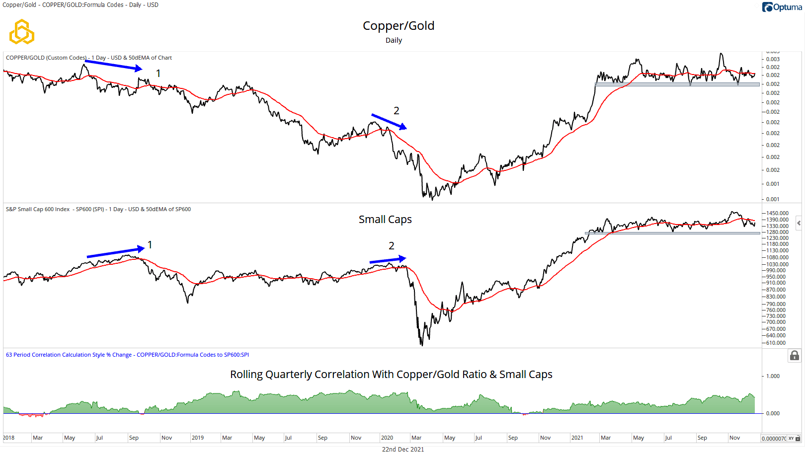
Let’s review a real-world application of the Copper/Gold ratio and economically sensitive stocks via the S&P 600 Small Cap Index.
On point 1 in the chart, in the summer of 2018, you’ll see the Copper/Gold ratio declining substantially, signaling a global growth slowdown long before stocks reacted violently in Q4 of the same year. The stress then cascaded over into the Global equity markets, marking a sharp and fast downturn and subsequent recovery.
The Copper/Gold ratio then bottomed several weeks after stocks, in this instance, solidifying those markets will never make it that easy for us. Depending on how granular the relationships are viewed, the ratio oscillates back and forth between leading, lagging, and coincidental.
While economic theory would have us believe that Copper demand should lead or at least be coincident with stocks as a discounting mechanism, it does, at times, lag.
On point 2, in the first two months of 2020, the ratio began a steep descent and subsequent breakdown, again leading Small Caps in a period of heightened volatility and again bottoming several weeks later than stocks. This ratio has been stubbornly flat and trendless for the majority of 2021 as stocks trade down from their highs.
Will the ratio once again break down and lead Small Caps in yet another decline of epic volatility—or will the stocks continue their descent with the ratio, failing to break down and signifying a possible buying opportunity?
Only time will tell; for now, we are putting a lot of weight on the highlighted area on the ratio as a tell for risk assets.

Regional Banks/REITs
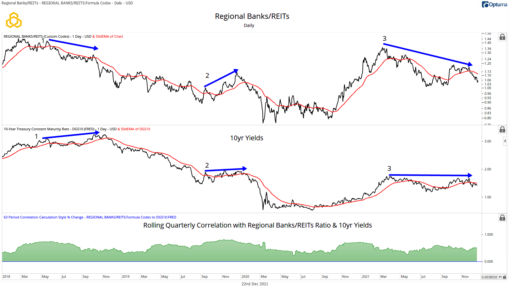
This ratio is one of the biggest “tells” for interest rates. Regional banks tend to flourish in higher-yield environments, and REITs tend to thrive in lower-yield environments.
As such, the ratio looks virtually identical to the chart of 10-year Yields. This ratio and the interest rates don’t disagree often, but it’s crucial information when they do.
No indicator or ratio is correct all the time, and you’ll see a great example of a false signal right in the middle of the chart; the second half of 2019 saw the ratio making higher highs and higher lows while yields were essentially flat. Case in point, from February to October of 2018, the ratio spent most of the year in a downtrend, making lower highs and lower lows while interest rates were rising. A disagreement that the ratio eventually lost.
The equity market was clearly discounting lower interest. From there, these two have mostly traded in lockstep with no significant divergences until recently. The ratio has been making much lower highs while rates have stayed flat for most of the year.
A warning light of a character change in interest rates could be presenting itself, but we will have to wait to see.

S&P 500 Low Volatility Index to the S&P 500 High Beta Index
This relationship moves very closely with the U.S. Dollar Index. This makes sense for a few reasons, but let’s unpack an often-unspoken characteristic about portfolio management. Many large institutions where large players are enough to make markets trend over time have mandates that force them to always be in the market and have a certain allocation to stocks.
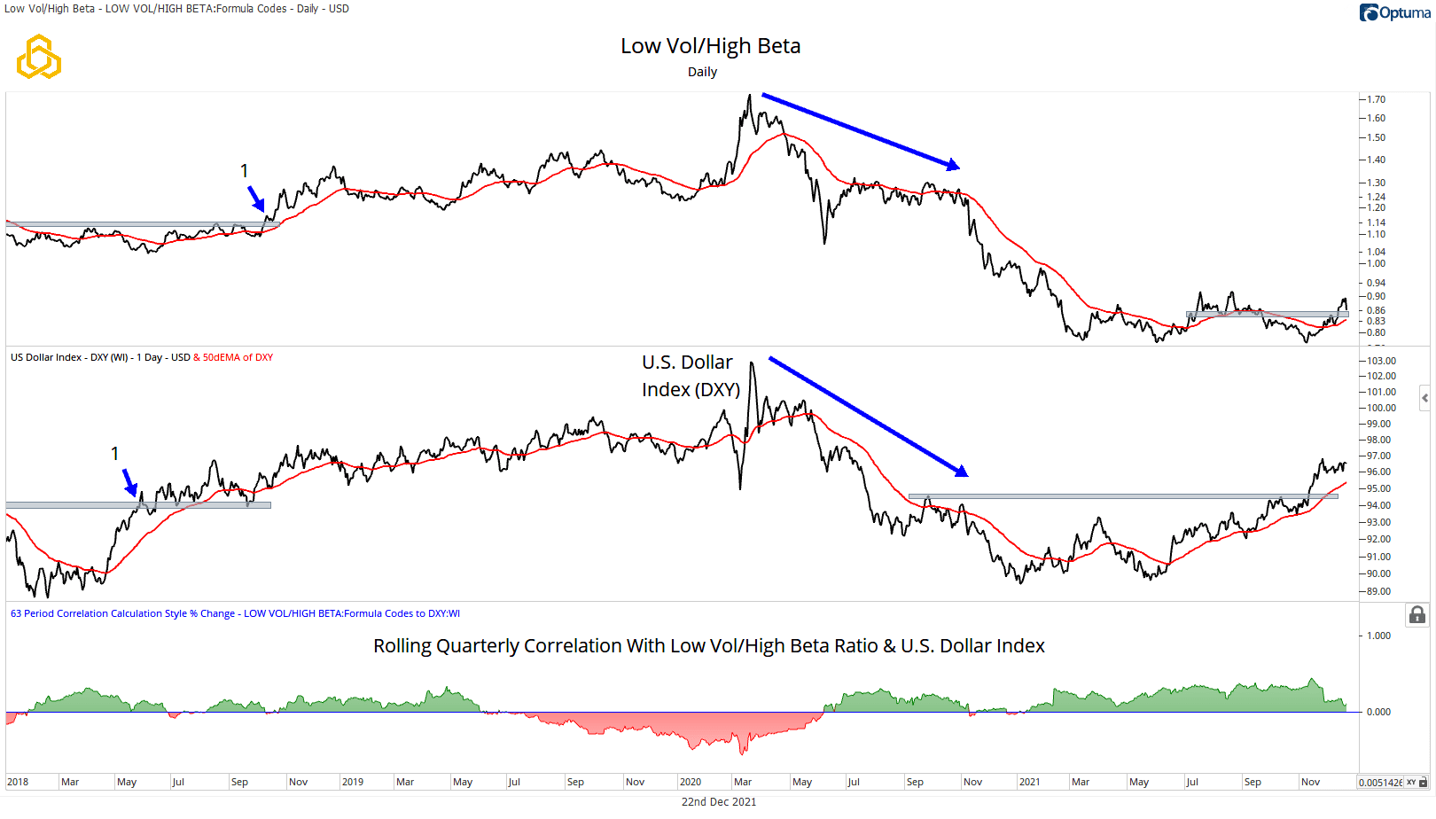
When the Low Volatility/High Beta ratio rises, demand for less risky stocks outpaces demand for more risky stocks. It should come as no surprise that this relationship looks very similar to another asset that investors prefer when they’re concerned about market volatility: U.S Dollars.
Despite these two relationships coming from completely different asset classes, they do tend to trade in sync in periods of heightened uncertainty. However, no relationship correlates all the time, and the ratio of Low Vol/High Beta and DXY relationship provides us with examples of both.
On point 1 in the chart, we see the DXY breaking out all the way back in May of 2018—long before fears of slowing global growth spread over to other markets. The Low Vol/High Beta ratio finally broke out in October of the same year and continued to trade closely with the DXY until markets recovered in 2019 and 2020. Here we have two “risk-off” relationships that have a history of trading closely together that we should be able to use into the future, right? Well, as we said before, markets never make it that easy for us.
The DXY became correlated and sold off along with risk assets in the first part of the COVID crash as Low Volatility stocks were outperforming their riskier counterparts. Intuitively this stands against reason, as the DXY “should” be in high demand during periods of extreme uncertainty, particularly compared to other world currencies.
DXY subsequently rebounded over 6% in a matter of two weeks, a large move in that timeframe for all but the world’s most unstable currencies. It wasn’t until the summer of 2020 that the Low Vol/High Beta and DXY relationship once again became positively correlated.
This example goes to show that while Intermarket Analysis can be incredibly powerful, it can also be perilous if it’s the only form of analysis relied upon.
Recent price action has the Low Vol/High Beta ratio knocking on the ceiling of a resistance level above an upward sloping 50-day average. At the same time, the DXY broke out from a major long-term range in November above an upward sloping 50-day average of its own.
The quarterly correlation of the two remains in positive territory, and the action is eerily like that of 2018.

High Yield Bonds to Government Bonds
The interpretation is simple: if we are in a risk-on environment of broad economic growth, demand for sub-investment grade corporate bonds typically outpaces the demand for more conservative government bonds.
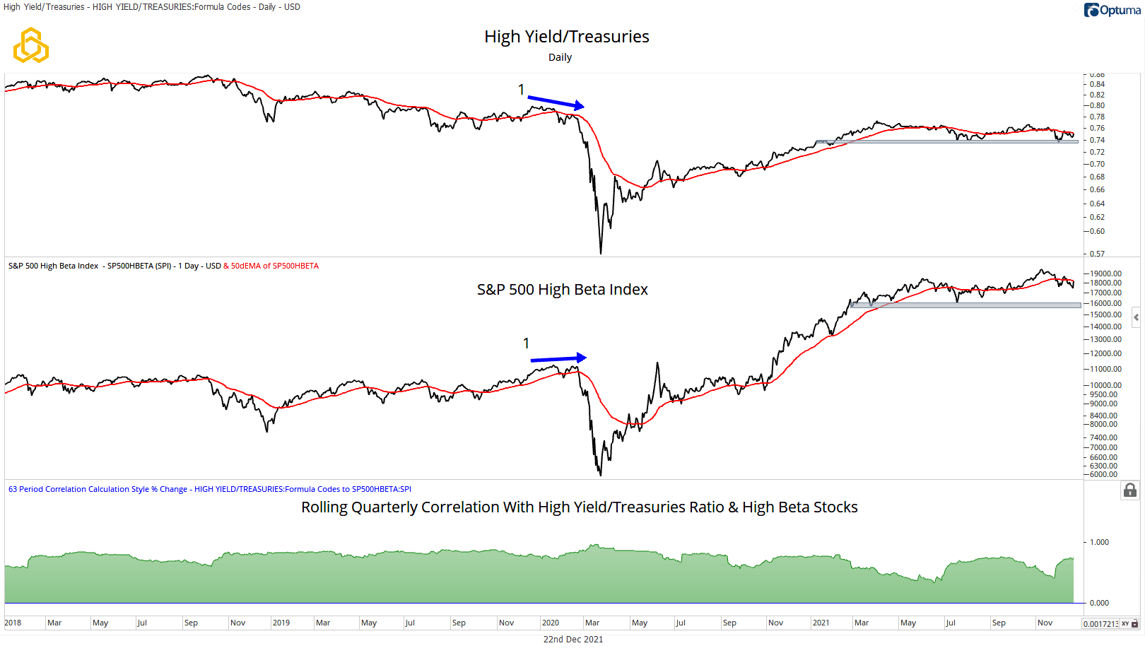
Another market part that’s highly sensitive to broad economic growth is High Beta stocks, represented by the S&P 500 High Beta Index. These stocks historically move at a greater magnitude than the index itself. When they are outperforming, investors are comfortable taking an above-average risk. This is one of the most positively correlated relationships that we look at, with quarterly correlation figures spending most of the time above +0.5.
One attribute that you’ll notice is these move nearly in lockstep, making divergences (disagreements) quite rare. Highlighted in the chart by the blue arrows, the COVID meltdown saw the ratio trending to the downside while High Beta stocks remained low until ultimately catching down to the ratio.
It appears that the ratio tends to lead yields, and this makes sense intuitively, as the riskiest parts of the bond market tend to shoot first and ask questions later. Many times, it’s been said that the bond market is smarter than the stock market. We’ll leave that argument to the readers to decide, but we’d like to think they’re both quite intelligent.
Again, the theory that underpins these two relationships is very sound, and historically they correlate, but there are no rules in capital markets. We understand that given a long enough timeframe, we could see a scenario presented that’s very similar to the Low Vol/High Beta Ratio and DXY relationship becoming decoupled for months at a time.
Recent times have found the ratio testing a long-term support area while yields have further to fall to its support area. Will this turn out to be another case where the ratio leads yields, only this time to the downside?
It remains to be seen, but price action at this support level is being keenly watched.

Relationships Matter
There are many market relationships that we can use to either add or subtract from the evidence that we are seeing in the major asset classes.
Price is king, and the markets are never wrong, but investors can certainly be wrong—it’s important to keep that in mind with any methodology we apply in capital markets.
Knowing how to use these tools remains the most critical part of the process. We don’t take any relationship or indicator on its own, and we want other unrelated indicators and relationships to confirm.
What happens when they disagree? Well, that’s valuable information too.
Investors who incorporate Intermarket Analysis into their process are less likely to be surprised by changes to the prevailing market trends when divergences are present. Divergences can be used to calibrate how aggressive investors may want to be. Simultaneously, they can have more confidence that a trend will persist when important Intermarket themes are confirmed.
Disclosure: This information is prepared for general information only and should not be considered as individual investment advice nor as a solicitation to buy or offer to sell any securities. This material does not constitute any representation as to the suitability or appropriateness of any investment advisory program or security. Please visit our FULL DISCLOSURE page.
