
For many professional money managers, the reality of remaining invested in the capital markets across market cycles can be both comforting and daunting. Clients large and small often have Investment Policy Statements (IPS) and other formalized objective statements that require their managers and fiduciaries to always have exposure to the markets.
For many investors, this long-term focus limits the potential mishap of missing a major upside move in the markets and focuses on riding the waves of downtrends that follow in the belief that markets ultimately rise over the long haul.
For those who must remain invested in the markets, relative, or “ratio analysis,” has been utilized for decades by analysts and managers to both identify sections of asset classes that are performing well and avoid those that aren’t. Relative analysis, in its simplest form, is viewing an asset in terms of another or dividing its price by the price of another asset for comparison purposes.
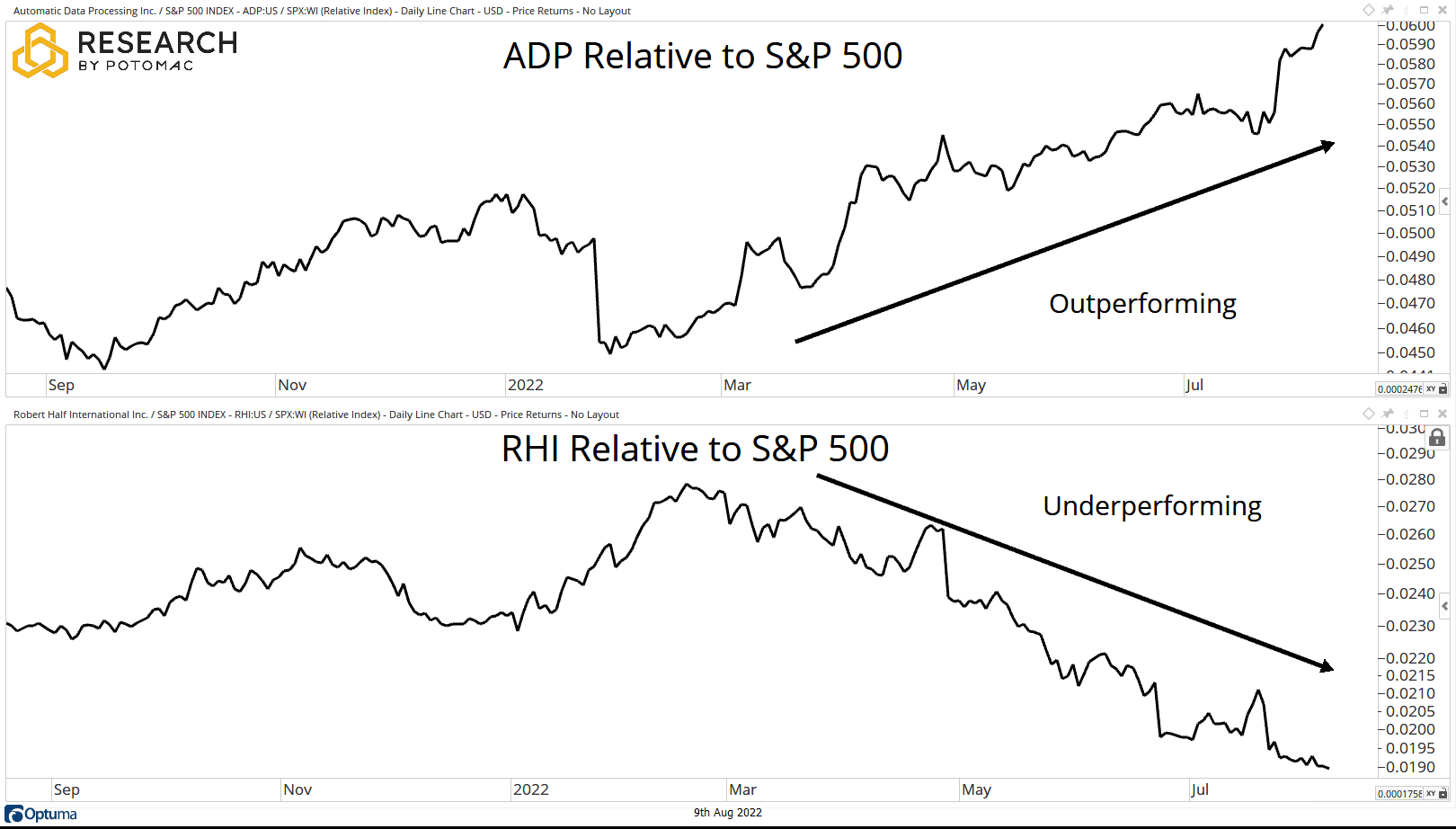
This output provides the market participant with a plot that can then be utilized to determine trend, momentum, volatility, and any number of analysis forms that the user decides. If the output plot is rising, this means that the asset in the numerator is strengthening in relation to the comparative asset in the denominator and vice versa. See an example of this in the chart below.
Before we dive too deep into the details of ratio analysis, let’s take a step back and review several use cases where practitioners of all varieties can find value in its application. Those who manage client money, objective statements, and IPS often provide investment managers with allocation ranges for various asset classes.
In a former life, working with a wide variety of clients and working within the confines of a variety of investment objectives and IPS, varying ranges for asset classes, including stocks, bonds, commodities, alternatives, and cash, are commonplace.
However, the investment manager is often faced with the perennial question based on the current (and potential future) market environment: which asset classes should be overweighted relative to the target allocation? Which should be underweighted? While an infinite amount of data points can be gathered to assist the manager in making such a decision, this often requires an inordinate amount of time and energy on the part of the manager.
Additionally, ensuring that the wide variety of variables involved in the decision-making process is accurate is no small feat. Ratio analysis quickly, simply, and efficiently helps to aid in this process. While ratio analysis can be incredibly useful, it’s important to point out that just because something can be compared, it doesn’t necessarily mean that it should. The most important point for the user to keep in mind is that they are making their comparisons based upon both the constraints of the portfolio and the timeframe in question.
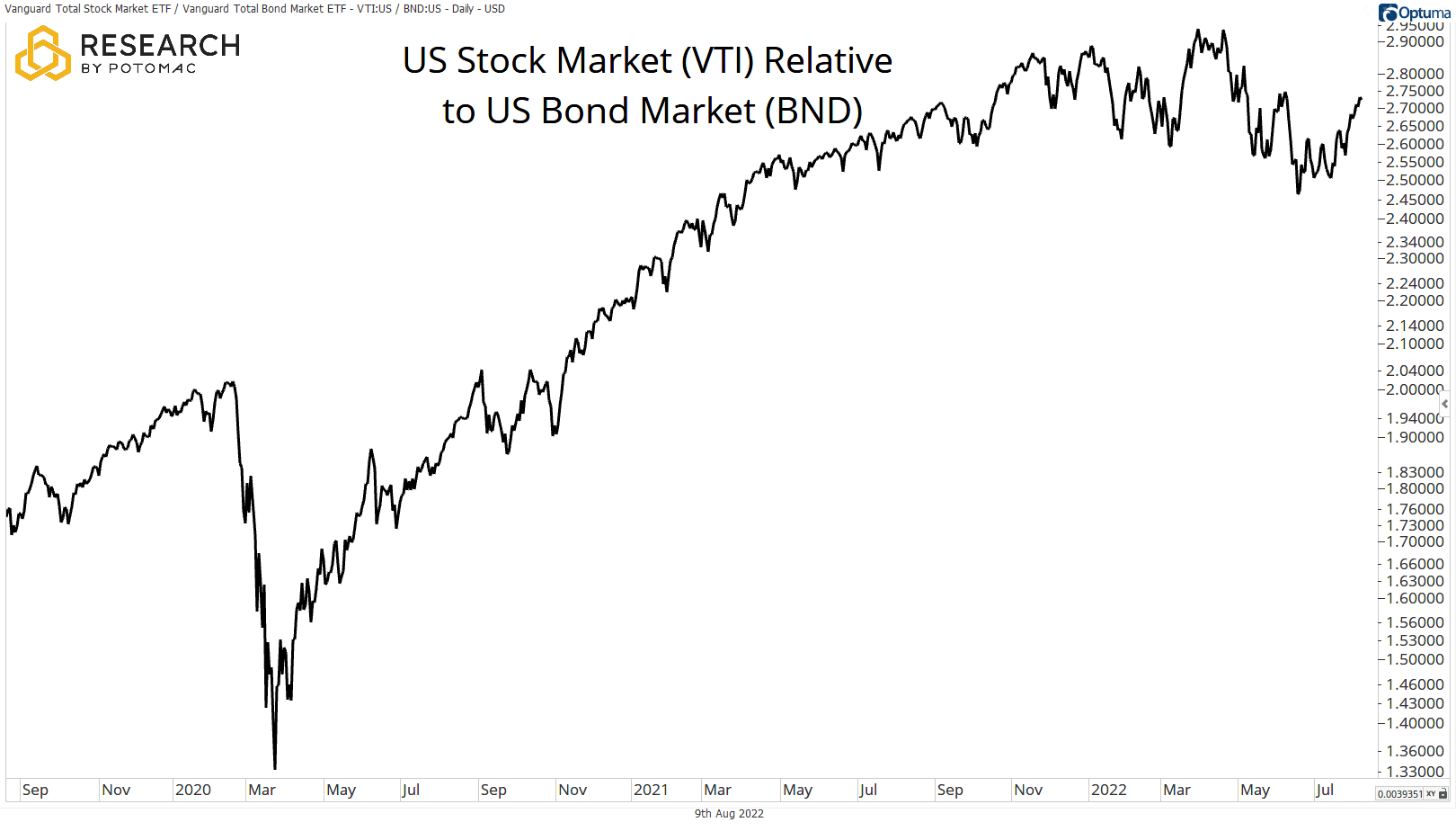
Let’s look at an example in the chart below, where the US stock market (VTI) is compared to the US bond market (BND) via ETF proxies. This example is often one of the first questions that discretionary managers of diversified portfolios must ask themselves: should stocks or bonds be overweighted relative to the target?
In the example below, a broad measure of equities (VTI) has been outperforming a broad measure of bonds (BND) as the ratio has been gradually rising over a three-year period despite recent consolidation.
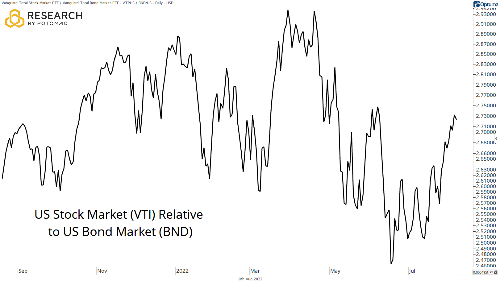
These examples bring us to another important characteristic: timeframe. What timeframe is best for the practitioner to utilize? What other timeframes can be of service in this analysis? The answer to the first question is often easier than the second.
For managers who are performance benchmarked over a specific timeframe, such as one or three years, the benchmark timeframe is the likeliest candidate for the primary analysis. However, reviewing relative price action on one timeframe higher can be very beneficial. For example, if daily data over the prior one or three years is the timeframe for a performance benchmark.
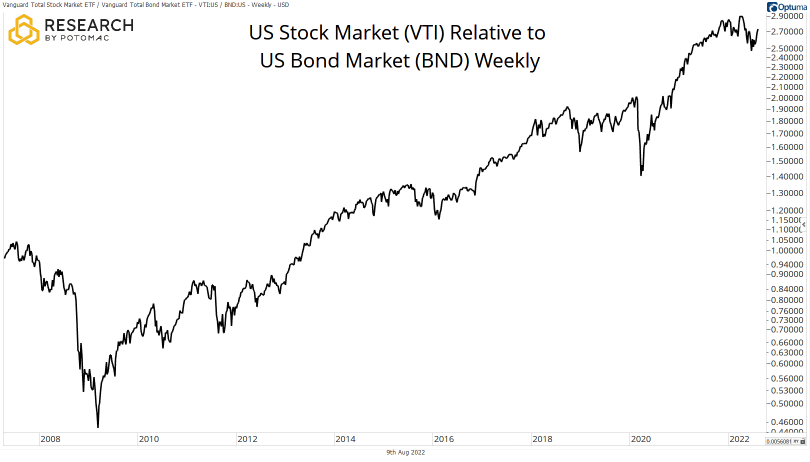
The chart below is a prime example of reviewing the stock-to-bond relationship over a higher timeframe. In this case, it’s a weekly line chart of VTI relative to BND over several years. We can see that the primary trend is clearly in favor of stocks relative to bonds (using these proxies); however, it does appear to be in consolidation, as shown on the one-year chart in the sections above. The knowledge that the primary trend over a very long time can be an important data point that the investment manager takes into consideration along with the price action on their relevant timeframe.
The examples, analysis, and thought processes outlined in the sections above should serve as examples for how investment managers can apply ratio analysis in their portfolio management process to efficiently and simply identify trends and aid in decision making. This price-based analysis weeds out the overwhelming amount of variables that many fiduciaries and investment managers struggle to find the time to compile and focuses solely on the trends of the market. This post is not meant to be an exhaustive list of analysis and application, as there is an infinite amount of creative ways that investment managers can take the applications provided and further expand upon them to best serve their process and client constraints.
Disclosure: This information is prepared for general information only and should not be considered as individual investment advice nor as a solicitation to buy or offer to sell any securities. This material does not constitute any representation as to the suitability or appropriateness of any investment advisory program or security. Please visit our FULL DISCLOSURE page.
