The moving average crossover is one of the most widely cited price action developments from market technicians across financial media and professional research. Our June 2020 blog post covered the basics of moving averages and their application as a risk management tool. This blog post serves to investigate the ominous-sounding “death cross” to see if it really is as bearish as it sounds.
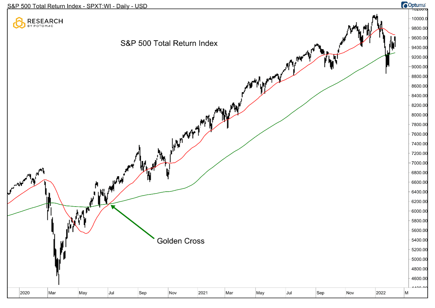
Before moving further, it is worth noting that shortly after the original post was published, the S&P 500 Total Return Index triggered a “golden cross” on July 6th, 2020, when the 50-day moving average crossed above the 200-day moving average. That signal remains in play as the shorter moving average (red) continues to hold above the longer moving average (green).
THIS REPORT is brought to you by Research by Potomac. Access the full Advisor toolkit and get a deeper look at the markets.
Something that should immediately jump off the chart is that the July 6th cross was more than three months after the low produced by the COVID pandemic. We also note that the signal remains open even though the index is off the highs reached in January 2022.
This is a feature of moving averages, not a bug. They are designed to generate trend-following signals. There must be a trend to follow to make a trend-following system. Using moving averages will not allow an investor to buy the low or sell the high. Additionally, while signals are much less frequent, they do a great job of filtering out erratic noise within the trend.

The 50/200-day moving average crossover isn’t the only moving average crossover in town; however, it’s probably the most widely cited across various financial media outlets. The most apparent problem with testing this development is that this system is very slow-moving and, as such, generates a relatively small sample size to test if one is trying to reduce the market’s long-term bias to rise.
Enter the 21/63-day moving average crossover. While the numbers of these moving averages may sound random or unusual, they are chosen for good reason. There are 21 trading days in the typical month and 63 trading days in the typical quarter. When applied to daily data, this system gives a much larger sample size but, as such, gives a higher frequency of “false” signals.
When the 21-day moving average crossed below the 63-day moving average, this (in theory) signifies that the intermediate-term trend has materially broken down and is generally interpreted as a bearish condition for the asset or index in question. Like everything we do here, we take nothing at face value. While conducting our work for the Research by Potomac product, we noticed that the data does not align with the bearish “death cross” narrative.
Before we dive into the test results, it’s important to layout the subtleties of performing any test on an indicator within markets.
There are several options as far as timeframes go—none of which are “correct” for every investor. It’s important to keep in mind the market’s tendency to trend over the long term. There are both simple and complex methods to detrend and test data, but we prefer to stick to the simple: testing from March 1st, 2000, to Marth 31st, 2013. This timeframe provides a flat, trendless environment with two major drawdowns and subsequent recoveries over a reasonably long period of time.
Examining the Results
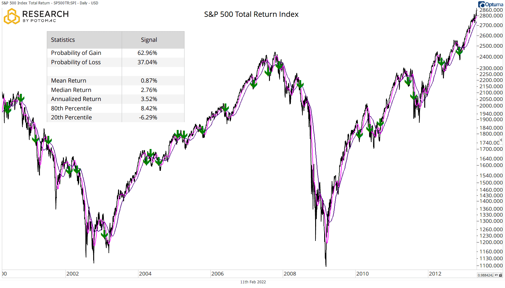
For the S&P 500, there were 27 instances in this timeframe where the 21-day moving average crossed below the 63-day moving average for a median gain total return in the index of 2.76%, with a 62.96%-win rate over the following quarter. This compares with a median 63-day total return of 2.10%, with a 59.87%-win rate for the S&P 500.
As it turns out, this signal has been contrarian bullish for the index when taken in isolation, at least over this timeframe. It’s worth noting that while the signal itself has been contrarian bullish in nature, some of these signals have naturally occurred during significant downtrends in the market. As with any system, risk management is key, and knowing that signals can occur during periods of prolonged market drawdowns helps set expectations.

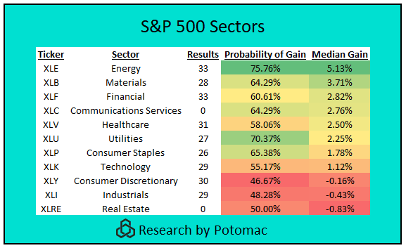
What about the sectors within the index? When this development is tested on the individual sectors, the median gain for the group of sectors was slightly reduced at 2.36%, with a lower 60.53%-win rate over the following quarter. While there doesn’t appear to be a clear risk-off theme when this happens at the sector level, it’s worth noting that most of the cyclicals have been the top gainers when this development occurs. *Note that XLC and XLRE did not exist in the 2000-2013 timeframe.

The contrarian bullish picture appears even more clear when the 21/63-day moving average “death cross” is tested on the individual stocks that composed the index between 2000 and 2013. Taken as a group, the median gain for stocks in the index was 3.36%, with a 59.15%-win rate over the following quarter on a sample size of 21,983. While these results have been encouraging and positive for the bull case, it’s worth noting that there is a considerable amount of positive skew in the data—meaning that there are a small number of stocks with outsized gains that are dragging up the distribution of returns. However, a positive skew is generally more favorable than a negative skew.
But that’s not the point. Whether a large move to the upside or the downside follows one of these death crosses, it is impossible to determine which it will be. To receive the benefit of sidestepping a large sell-off, an investor must “take” every signal. They must sell every time one of these crosses occurs.
That brings up a new problem. If you sell every time there is a death cross, what gets you back in? The answer to this question depends on the strategy being employed and is unique to every investor.
Someone who has determined that they are going to buy and hold equities while dollar-cost averaging (DCA) into the market at predetermined intervals should, in theory, ignore these crosses and the negative connotations surrounding them. At the same time, the fact that stocks generally move higher after these crosses occur should not cause this buy-and-hold investor to deviate from their plan either.
Then who should care about these moving average crosses? At a high level, someone who has determined that they will be more active or tactical with their portfolio management. This is the person who should be able to answer the question, “what gets you back in?” Perhaps the reentry occurs when the short-term moving average crosses back above the long-term moving average. In this case, when the 21-day crosses above the 63-day.
This is the investor who should take every signal. When the dreaded “death cross” arrives on the market’s doorstep, they can sell, knowing that they have a rule in place to help them reenter the market.
Should the “death cross” prove to be short-lived, will they give up some returns? Of course, they will.
However, perhaps this “price” is worth paying should the death cross prove to be longer-lasting, leading to a deep decline for equity markets. As the Zac Brown Band tells us, “There’s no dollar sign on peace of mind.”
The investor who tends to run into trouble and most likely “whipped” by these signals is the one who has no plan at all.
This is the person who will see a “death cross” and the negative attention it receives and decide to sell. When the death cross proves to be a false signal, they will not have a plan for getting back in. If they do reenter, it could be at much higher prices. Here is the kicker, though, the next time there is a “death cross,” this investor may ignore it. After all, it didn’t work last time. That’s when the market will move into a deeper drawdown. Without a clear plan, emotion takes over, increasing the odds of more poor decisions.
Bringing It All Together
Has the death cross been unequivocally disproven as the harbinger of doom that many claim it to be?
Absolutely not.
In fact, a sizeable portion of these results does occur in market drawdowns that have led to even further drawdowns. What is noteworthy from the timeframe in question is that most of these signals have been more bullish than bearish when taken in isolation and have historically led to above-average gains in the S&P 500 and its components.
At the very least, this should provide further proof that one data point or indicator, taken on its own, is likely not good enough to create a robust trading or investment system. There should be clear rules for entries and exits. More importantly, these rules should be followed all the time.
Our next blog post will explore these moving averages crossovers in more detail, looking at data across different lookback periods. Additionally, we will have the chance to review the “death cross” that is currently taking place on the NASDAQ Composite Index.
Disclosure: This information is prepared for general information only and should not be considered as individual investment advice nor as a solicitation to buy or offer to sell any securities. This material does not constitute any representation as to the suitability or appropriateness of any investment advisory program or security. Please visit our FULL DISCLOSURE page.
