
Let’s start the new year by continuing our discussion of Intermarket Analysis. It’s as good a time as any—maybe more so since January is the time of year that everyone is making their predictions.
How fast will the economy grow in 2022? Where will the S&P 500 be at the end of the year? What about inflation?
Every year I’m amazed so much attention is paid to predictions about the economy and what it will mean for the stock market. Perhaps this is because I wouldn’t say I liked learning about economics in school. It was novel and new in high school, but ultimately it was a bore.
By the time I reached undergrad, I already had two summers at the NYSE under my belt. I couldn’t connect what was being taught in class and how to make money in the markets. Years later, I had to take economics as a prerequisite in graduate school because I was coming back to academia too many years after completing my undergraduate work.
However, I did not learn anything new!
If the past two years have not cured people of making a connection between the economy and the market, I don’t know what will.
I think the biggest issue that I have with economics is the fact that it’s backward-looking. We get the December job report in January, GDP data is usually stale when it’s reported, and that stale data is revised two or three times before it’s deemed official.
Intermarket Analysis Is Better than Economic Analysis
It occurred to us that there must be a better way. If the markets truly are discounting mechanisms, then this stale data that is reported in economic statistics will first show up in asset prices.
This thesis is what led to the use of the Copper/Gold Ratio as a proxy for investor expectations for global growth or contraction. We don’t have to wait for GDP reports or global PMIs to determine if investors think that growth is accelerating or decelerating; we should see it in our Intermarket relationships.
If growth is accelerating, that should lead to a rise in interest rates. Should we wait for the economic reports to tell us that this is true? We could, but the key trends will likely be well established by then.
However, we can possibly identify the trend sooner by using the Intermarket relationship between Regional Banks, REITs, and Interest Rates.
You see, the key concept of technical analysis is to identify trends early enough so that they are still playable, then position accordingly.
With its stale data and multiple revisions, does economic analysis lend itself to the early identification of trends? I’ll give you a hint: the question is rhetorical.
This is not to say that Intermarket Analysis is perfect. The perfect market indicator or method of analysis doesn’t exist, evident in the fact that there can and will be divergences.
Remember, analysis is not about certainty; it’s about probability and tendency. However, what happens when the markets are simply conflicted? The rationale behind using the Copper/Gold Ratio as a proxy for economic growth makes sense. Still, it’s not the only proxy.
Some investors can and do use other commodities in the numerator, and one example that has been made popular by our friend Michael Gayed is Lumber.
The Copper/Gold Ratio and the Lumber/Gold Ratio are currently sending completely different messages despite the recent weakness in the Lumber/Gold ratio.
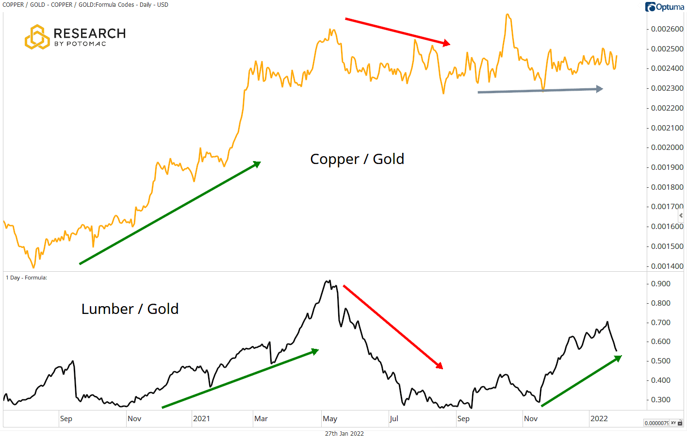
Which one is “right?” Copper, Lumber, both, or neither? We don’t and can’t know for sure.
Combined Intermarket Analysis Indicator
The divergences and mixed messages led to an internal conversation. If there are conflicting data points, it can lead to indecision—analysis paralysis, if you will.
That led us to wonder what would happen if we combined different Intermarket relationships into one indicator that can be used to get a sense of what kind of economic regime the market is currently discounting.
Enter the RbP Regime Index, an equally weighted composite model of four Intermarket ratios: High Yield/Treasuries, Copper/Gold, Regional Banks/REITs, and S&P 500 High Beta/S&P 500 Low Volatility.
Economically cyclical proxies are the numerator, while defensive proxies are the denominator.
The interpretation is simple: if the index rises, it’s “risk-on”; if it falls, “risk-off.”
Relationships
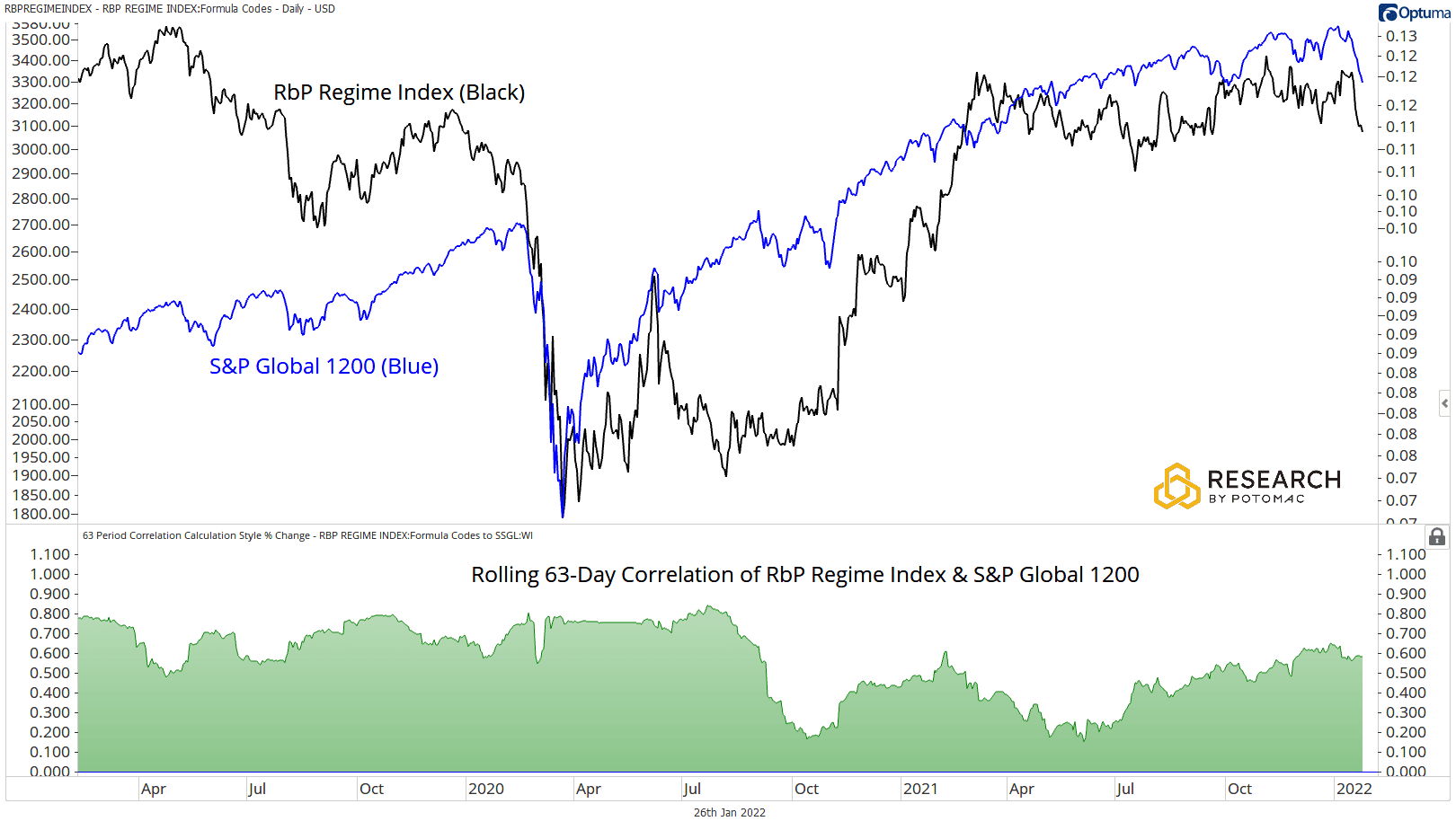
Let’s look at some historical relationships of this composite model and its surrogates: Global Stocks and 10-year US Bond. The chart below shows that the regime index and global stocks tend to rise and fall together.
The rolling 63-day correlation of this index with the S&P Global 1200 is +0.583 at the time of this writing and tends to oscillate, varying degrees of positivity. This makes the index highly useful for spotting divergences (disagreements) with equity prices.
By taking this methodology one step further than subjective/discretionary analysis, we put this index to the real test on historical results for our basket of Major US Equities & Factors (see our weekly scans note for more on this).
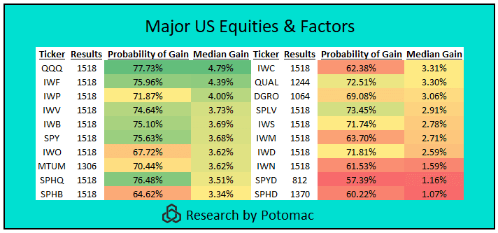
When the 63-day linear regression slope of the RbP Regime Index is positive, median gains for the basket were 3.26% with a 70.26%-win rate over the following 63 trading days since 2011, with all the ETFs in the group posting positive median gains over that timeframe.
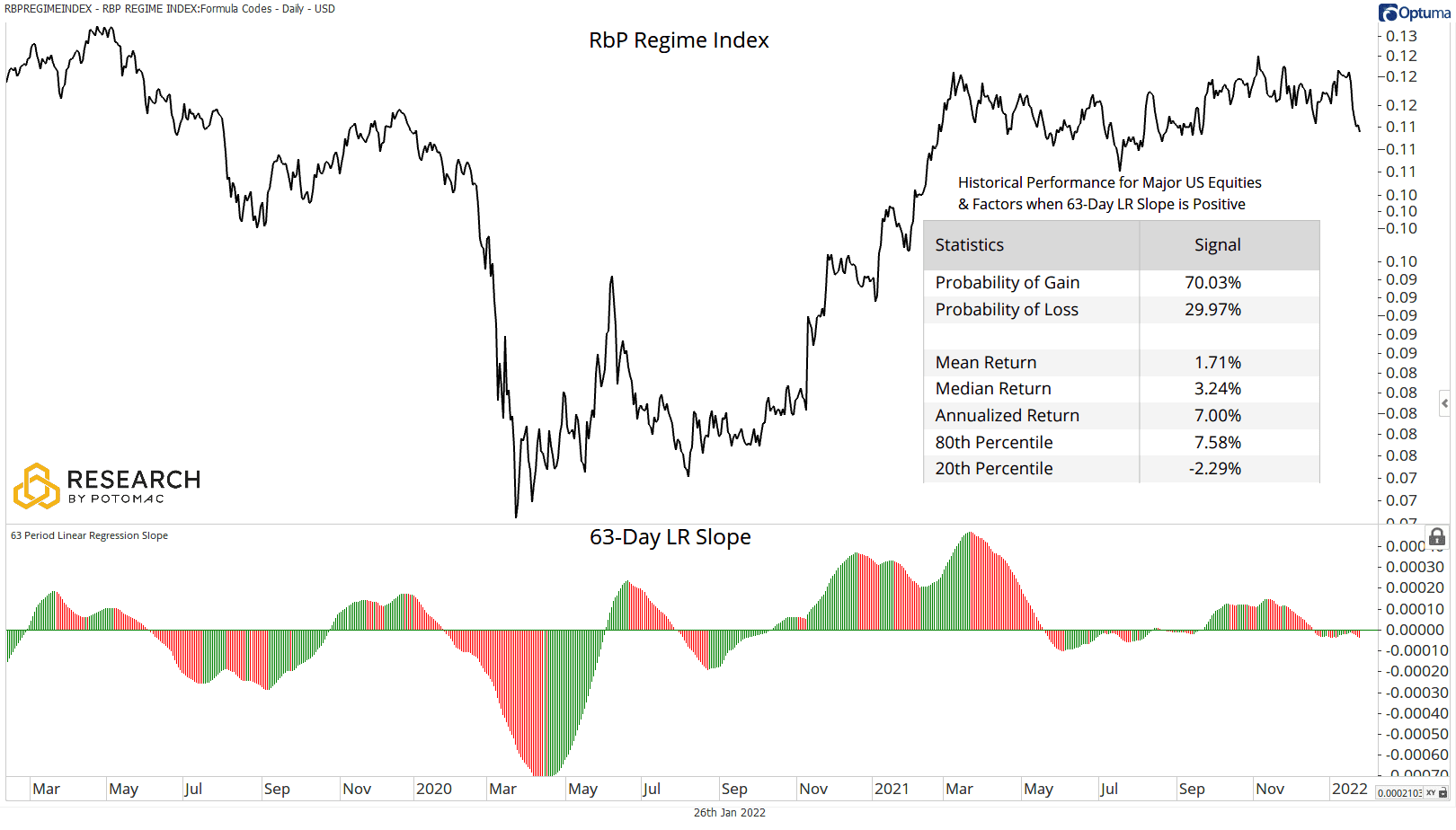
While the group tends to be positive when the index rises (risk-on), there is a clear dispersion in performance between cyclical and defensive themes. At the top of the list are Growth themes such as the NASDAQ 100 and Mid Cap Growth, with the laggards being defensive themes such as High Dividend and Value.
Note that as performance declines into the more defensive themes, the probability of gain tends to decline as well. When the 63-day linear regression slope turns positive, these themes tend to speak to the index’s simple interpretation: investors have an increased willingness to accept more risk in that market environment.
While the index happens to be a useful proxy for risk assets, what does this mean for defensive assets such as bonds?
In the chart below, you can see the inverse relationship of this index with a more conservative investment such as 10-year US Bonds. As of the time of this writing, the rolling 63-day correlation of the index with US 10-year bond price is currently reading -0.566 and tends to spend much of the time oscillating about varying degrees of negativity.
Bond prices tend to fall when the index rises and vice versa.

Again, we take nothing at face value and put this relationship to the test on a basket of Fixed Income ETFs. When the 63-day linear regression slope of the RbP Regime Index is negative (risk-off), median gains for the group were 32bps with a 59.77%-win rate over the following 63 trading days since 2011, with many ETFs in the group posting positive median gains.

Despite the group being slightly positive overall, there are some noteworthy results in performance dispersion across risk themes.
When the 63-day linear regression slope of the index is negative, the top performers were a mix of risky bonds such as Convertibles, Fallen Angels, and High Yield Munis and duration sensitive bonds such as Long-Term Treasuries and Zero-Coupon bonds.
Bottom performers were short-term treasuries, short-term corporate bonds, and fixed income volatility-linked products. While there is a mix of risk-on/risk-off performance, it’s important to note how strong longer-term duration-sensitive assets such as TLT and ZROZ have been.
Investors’ positioning within this group has not been as clear as it’s been within equities; one plausible explanation could be that equity investors simply have more to lose in a risk-off environment.

Investment decisions should never be made based on one data point, even if that data point is a combination of different trends. However, we can see that the RbP Regime Indicator can help determine if the market is likely to favor riskier assets or if investors are seeking havens.
The addition of a metric for measuring trends provide the opportunity to create signals based on the indicator to stay ahead of the reported data.
The fun and exciting part is that we don’t have to stop there. The door is open to a lot more analysis.
Can we add to the index? Is the 63-day LR Slope right for everyone? (it’s not). Is there useful information that can be obtained by adding moving averages or bands?
Stay tuned over the year as we implement these thoughts and ideas into our research process.
Disclosure: This information is prepared for general information only and should not be considered as individual investment advice nor as a solicitation to buy or offer to sell any securities. This material does not constitute any representation as to the suitability or appropriateness of any investment advisory program or security. Please visit our FULL DISCLOSURE page.
